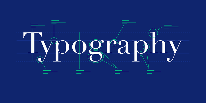
In visual communication, headline fonts are a pivotal element that can make or break the viewer’s first impression. Fonts can convey mood, tone, and personality, making the selection of an appropriate headline font a critical consideration for any brand or publication. The choice of headline typeface plays a significant role in reader engagement and brand perception. This article will explore the importance of headline fonts and how they can influence the effectiveness of written communication.
The Purpose of Headline Fonts
Firstly, let’s consider the primary purpose of a headline font. Headlines are designed to grab attention and draw readers into the content. They are the make-or-break point of engagement: a well-crafted headline font can captivate a reader, while a poorly chosen one can cause a reader to lose interest before even beginning to digest the content. Headline font is a stylistic and strategic tool to entice and retain the reader’s focus.
Characteristics of Effective Headline Fonts
When choosing a font for headlines, there are a few key characteristics that one should consider:
Relevancy
The font should reflect the tone of the content or the brand’s personality. A tech company might opt for a sleek, modern sans-serif font that conveys innovation, while a historical magazine might select a serif font that resonates with tradition and credibility.
Versatility
A good headline font should be versatile enough for various platforms and devices. With the rise of digital media, it’s crucial to ensure that your chosen font maintains its impact on small smartphone screens and large printed posters.
Influence on Brand Perception
The font used for a headline can also significantly influence how a brand is perceived. Fonts have psychological underpinnings that can evoke emotion and create associations in readers’ minds. For instance, a luxury brand using a refined, elegant script font can instill a sense of exclusivity and sophistication. Conversely, a start-up might use a bold, contemporary typeface to project an image of being forward-thinking and dynamic.
Trends in Headline Fonts
Keeping abreast of font trends can be beneficial, particularly in competitive industries where capturing the fleeting attention of consumers is vital. However, trendiness should always maintain readability and appropriateness. A balance must be struck between contemporary and timeless, especially for brands looking for longevity and consistency in their visual identity.
The Role of Custom Fonts
Many brands have invested in custom fonts explicitly tailored to their needs. Custom headline fonts can incorporate unique elements that can’t be found in off-the-shelf typefaces and often convey a distinctive brand identity.
Conclusion
Headline fonts are more than an afterthought; they are essential to brand identity and reader engagement. The careful selection of a headline font can immediately communicate a brand’s values, establish mood, and either engage or dissuade potential readers. As such, brands and publishers must not only choose their headline fonts with intention but also continually evaluate the effectiveness of their choices in connection with their audience and goals. Notably, as digital content grows and evolves, so must our understanding and application of headline fonts, ensuring that they maintain relevance and impact in the fast-paced world of visual communication.